A web page usually has some sort of order the designer tries to guide the user through. There are plenty of ways and elements involved in getting the user to read through the content, but I’ll focus on some pretty simple and standard ways to create contrast in order to push the message of the site and hopefully accomplish the company’s goals.
Contrast Through Color
Color is probably the first thing that comes to mind when thinking about contrast. Especially important with typography, color contrast creates a visual distinction between elements and dictates what is “important” to read and what is “more important” to read.
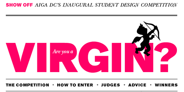
Sure, the word “VIRGIN” will grab your attention, but there’s no doubt that hot pink stands out beautifully on that pure white.
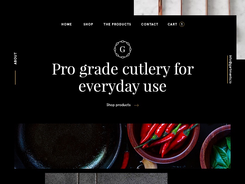
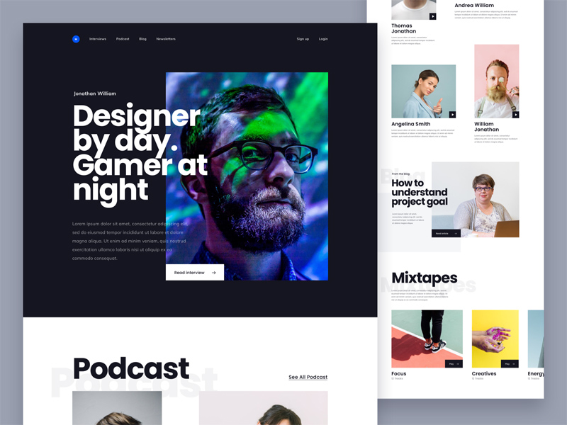
You can’t get more contrast than black and white. A quick glance at the site and it’s very clear what the message is.
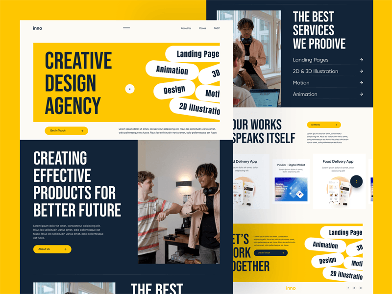
The color contrast created with the background makes the foreground content area well framed and easy to read.
Contrast Through Size
Large fonts, images and elements are quickly noticed by users. While over sized elements are a more recent development in the web community, it operates on the basic principles of contrast: big things stand out when placed next to small things.
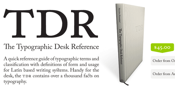
Text doesn’t get more readable than this. There’s a reason newspapers use large, black, serif fonts.
By keeping the style of large bold fonts throughout the site, it becomes a clear indication of content sections.
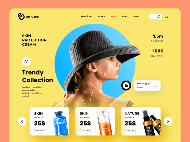
With a central portrait photo, it’s no mistake that a huge space was dedicated to tell the user exactly what the site is about and focus the user on the message.
Contrast Through Depth
Depending on the style of a site, there can be many visual planes, but typically there’s a background, foreground and something beyond that for elements with drop shadows, indentations, grunge elements and more. These virtual layers are great because the designer can push elements closer to the user.
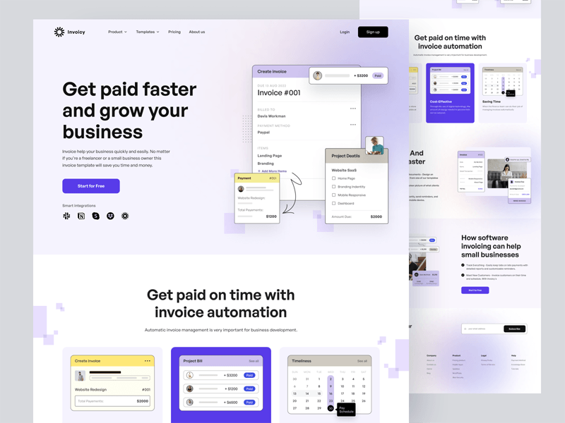
You can create shadows and lighting to push the screenshot forward and present the product in a professional and elegant way.
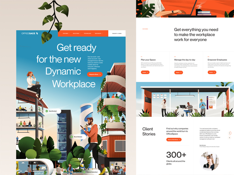
Fun elements like these are one of the first things scanned by the user because they push past the foreground.
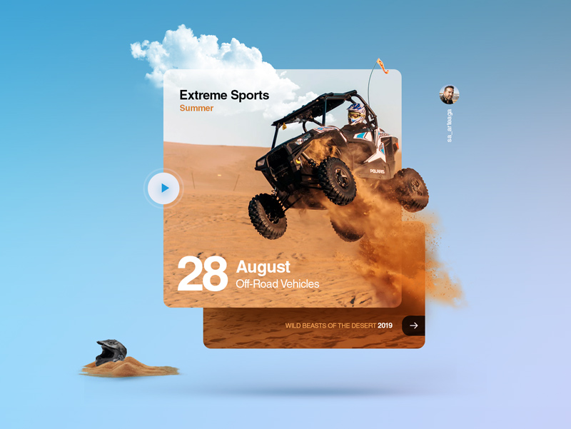
This off-roader appears closer to the user even without a drop shadow. It may not have a message, but it does enforce the feeling and mood of the site.
Conclusion…
There are many other ways to use these techniques, as well as other ways to create contrast in your pages. However, these techniques only work in moderation since they’re only effective through visual differentiation. If there’s nothing but 72pt gray text on a white background, nothing stands out and it becomes hard to read. Elements only look dark when they’re next to something light… elements only look big when they’re next to something small.