-
5 Reasons Why Wireframes Make Your Web Design Better
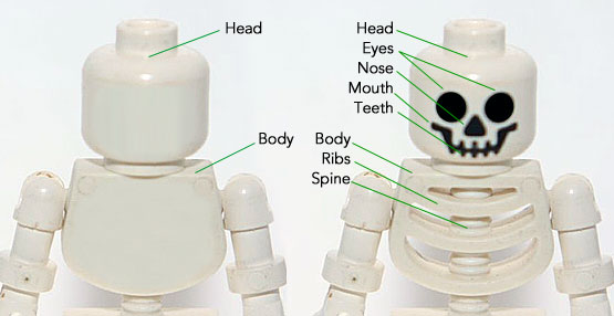
It’s pretty well established in the web design community that wireframes are an important part of planning a website and an essential step before diving into Sketch or Figma. A wireframe is typically described as a skeleton or blueprint of a site, but everyone puts in a different level of attention and detail to their wireframes. While they shouldn’t be a gray scale version of the final design, they should have enough detail to actually be useful to the client and designer.
With no colors, typography or images a designer can focus on laying out information in a way best suited to the clients project. In order to take advantage of this phase, it’s important to put some extra time, effort and detail in the wireframes, thereby saving time and increasing a site’s usability. While a wireframe doesn’t need perfect alignment, shades of color or font size, it should be a fairly good representation of layout, information/fields and proportional size of elements.
-
Drag & Drop UX Design Best Practices

A comprehensive guide on drag and drop UI/UX design, including pattern UX examples and UI demos. Read Full Article
-
Do you really understand CSS radial-gradients?

A blog post by Patrick Brosset: Do you really understand CSS radial-gradients? Read Full Article
-
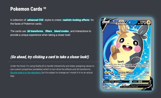
Pokemon Deckz
A collection of advanced CSS styles to create realistic-looking effects for the faces of Pokemon cards. Read Full Article
-
Building a tooltip component

A foundational overview of how to build a color-adaptive and accessible tooltip custom element. Read Full Article
-
Typographic Hierarchies

In this article, Alma Hoffmann discusses six basic variables to establish a typographic hierarchy, explains how to look at each differently, and in turn, designs pieces by intentionally modifying each variable to create a typographic hierarchy effectively… Read Full Article
-
Artworks as experiments

“You learn by doing,” they say; you can’t learn skills from theory alone. Experimentation is how we learn about the world, both individually and as a society. Read Full Article
-
Designing an accessible future

As an industry we measure accessibility using WCAG – the Web Content Accessibility Guidelines. There’s a huge update for WCAG on the horizon in the form of WCAG 3.0 which is going to completely change the way we t… Read Full Article
-
Where to put the primary button?

Where do you place the primary button in a button group? left? right? When does it go fluid? When does it stack on top? Read Full Article
-
OKLCH in CSS: why we moved from RGB and HSL

CSS Color Module 4 adds oklch(), and we gain P3 wide-gamut support, boost code readability, and improve developer-designer communication. Read Full Article