-
Productivity Tips for Designers
The right equipment is step 1 in staying productive. All of our designers are hooked up with two big monitors. Most everyone has Figma, Sketch or a program from the Adobe Creative Cloud on one monitor and inspiration or references pieces on the other. It’s not uncommon to see pictures of kittens, puppies, or wireframes on the 2nd monitor.
We aren’t afraid of taking breaks around here either. Studies have proven that taking a break every 90 minutes or so actually keeps your energy and focus higher than working straight through. Watching your favorite YouTube video doesn’t count… get up and stretch, drink a glass of water, or take a walk to Starbucks. Continue Reading
-
How To Grab A User’s Attention
A web page usually has some sort of order the designer tries to guide the user through. There are plenty of ways and elements involved in getting the user to read through the content, but I’ll focus on some pretty simple and standard ways to create contrast in order to push the message of the site and hopefully accomplish the company’s goals.
Contrast Through Color
Color is probably the first thing that comes to mind when thinking about contrast. Especially important with typography, color contrast creates a visual distinction between elements and dictates what is “important” to read and what is “more important” to read.
-
5 UX Tips for Usability
These are the days of the redesign. Maybe its is due to the fact that your site design was created 3 years ago and your needs have grown and changed since then or maybe you now find yourself looking to further increase the way your website benefits your business goals and makes you money. Whatever the reasons, your current site has probably become a bit of a Frankenstein creation with new pages, additional calls to action, and outdated information. But before you jump into a redesign there are steps that you should take to make sure that you learn everything you can from your current site and plan properly so that your redesign will be effective and beneficial to your company.

The following information is based on some of the many strategies that we, as a company, employ in order to test, study, and understand our clients current websites. The information that we can gather from these studies allows us to not only plan for the business goals of our clients but to adapt those to the usage habits and needs of the target audience and the existing site users. As I mentioned these are only a few of the possible ways that you can learn from your existing site before you retire it, but they will definitely get you on your way. Continue Reading
-
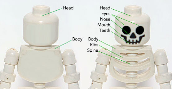
5 Reasons Why Wireframes Make Your Web Design Better
It’s pretty well established in the web design community that wireframes are an important part of planning a website and an essential step before diving into Sketch or Figma. A wireframe is typically described as a skeleton or blueprint of a site, but everyone puts in a different level of attention and detail to their wireframes. While they shouldn’t be a gray scale version of the final design, they should have enough detail to actually be useful to the client and designer.
With no colors, typography or images a designer can focus on laying out information in a way best suited to the clients project. In order to take advantage of this phase, it’s important to put some extra time, effort and detail in the wireframes, thereby saving time and increasing a site’s usability. While a wireframe doesn’t need perfect alignment, shades of color or font size, it should be a fairly good representation of layout, information/fields and proportional size of elements.
-
Drag & Drop UX Design Best Practices

A comprehensive guide on drag and drop UI/UX design, including pattern UX examples and UI demos. Read Full Article
-
Do you really understand CSS radial-gradients?

A blog post by Patrick Brosset: Do you really understand CSS radial-gradients? Read Full Article
-
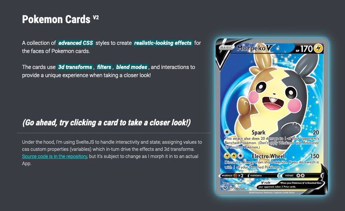
Pokemon Deckz
A collection of advanced CSS styles to create realistic-looking effects for the faces of Pokemon cards. Read Full Article
-
Building a tooltip component

A foundational overview of how to build a color-adaptive and accessible tooltip custom element. Read Full Article
-
Typographic Hierarchies

In this article, Alma Hoffmann discusses six basic variables to establish a typographic hierarchy, explains how to look at each differently, and in turn, designs pieces by intentionally modifying each variable to create a typographic hierarchy effectively… Read Full Article
-
Artworks as experiments

“You learn by doing,” they say; you can’t learn skills from theory alone. Experimentation is how we learn about the world, both individually and as a society. Read Full Article